


Introduction
In the ever-evolving world of managing projects, getting useful information from project data proves to be very beneficial. Picture having the power to not only get insights into your ongoing projects, but also comparing current projects with past ones. Using proper visualization techniques can also help in planning for future projects.
There are many softwares out there to make dashboards, but knowing which visual will bring the most value for you is very important. It’s important to understand the charts and graphs properly, to quickly and efficiently interpret project’s status.
In this blog, we’ll explore the transformative power of visualization techniques, diving into how they enhance our understanding, optimizing project processes, and ultimately shaping project success, , including within the context of white label website development.
Gantt Chart
One of the most popularly used project planning tool is Gantt Chart. It can be useful for visualizing timelines related with a project. It tells us when each task/milestone start, finish and how one task might be linked to another.
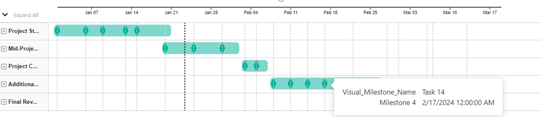
- Managing task dependencies:
Gantt Charts clearly show when one task must be done before others can start. This helps to organize tasks in the right order and makes sure that projects run smoothly.
- Resource allocation:
Gantt Charts help project managers distribute resources well. They figure out busy and slow times by looking at this kind of chart. This stops too much use of resources and makes sure team members are ready when they’re needed.
- Timeline and deadline tracking:
The Gantt Chart’s timeline view helps to easily follow the important points and time limits of a project. Project managers can quickly find out if tasks are on time or if there’s any delay.
- Communication tool:
Gantt Charts help project teams and stakeholders talk better about their work. They give a simple and clear way to share how long projects will take, who does what tasks, and updates on progress.
- Scenario planning:
Gantt Charts help with planning by changing how long tasks take or their order. This helps you check different project times and make smart choices about where to put resources based on what’s important.
- Client and stakeholder engagement:
When showing how a project is going to clients or important people, Gantt Charts give a simple and understandable view. This openness builds trust and improves talking with the clients.
Bullet Chart
Bullet charts are a kind of bar chart used to show your progress towards certain goals or rules.
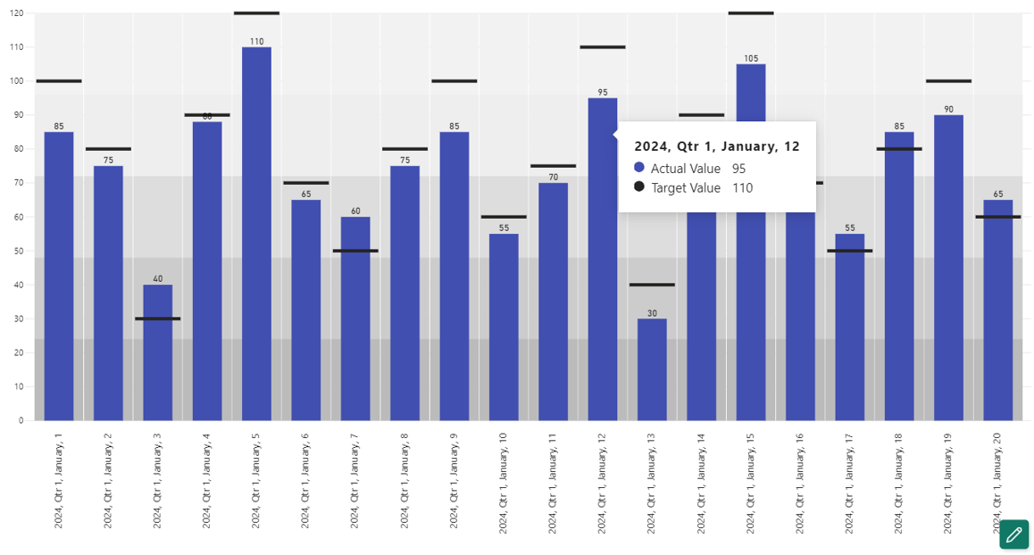
Here are some uses of bullet charts in project management:
- Progress tracking:
Use bar graphs to see how project goals or key performance measures (KPIs) are doing compared with what was planned. This assists project managers and others to quickly see whether everything is going as scheduled.
- Key performance indicators (KPIs):
Show important project outcomes like staying on budget, using resources wisely and finishing tasks fast with bullet charts. This helps you easily and clearly display results compared to tasks that need finished.
- Quality metrics:
Show numbers like errors or happy customers using line graphs. This lets us quickly check if the project is doing good on quality rules.
- Resource utilization:
Use a chart called bullet charts to see how resources are being used. Check out the strategy for using them and observe how it lines up with what’s truly happening right now. This assists in using resources better while working on the project.
- Timeline adherence:
Show how well the project is sticking to its timeline using line charts. Check out the planned dates for big events and compare them with actual finish times. See if something is late or done before it was supposed to be.
- Team performance:
Look at simple line graphs to see how well the team does in achieving big goals. This might include tasks such as how well a team works together, hitting deadlines or finishing goals for projects.
- Client satisfaction:
Use line graphs to see how satisfied customers are. Add feedback ratings and goals to these charts. This quickly shows how well the project is meeting what customers want.
Line Chart
Line charts are useful pictures that can be well-used for various purposes in project management
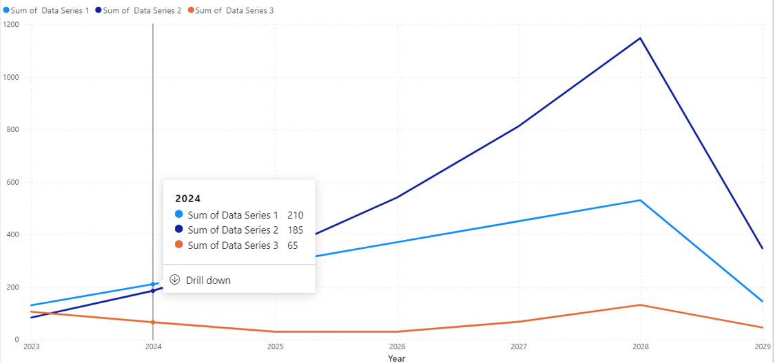
Here are several ways in which line charts can be employed:
- Project timeline visualization:
Use: Displaying project timelines.
Benefit: Shows a simple picture of when the project and the milestones and tasks within the project begin and end, helping people involved to see how long it lasts.
- Budget vs. actual expenditure:
Use: Checking the money spent on a project against its budget over time.
Benefit: Shows money patterns, helping project leaders spot possible extra spending or less cash spent. They can then fix these problems if they need to.
- Burndown charts for agile projects:
Use: Showing what’s left to do in an agile project across steps.
Benefit: Provides a picture of improvement, helping teams and people who care about the project see how well it’s sticking to goals for each small part.
- Milestone achievements over time:
Use: Showing when important project goals are met.
Benefit: Gives a list of important achievements, helping to measure how much the progress of all the project phases and if everything is sticking to the respective deadlines.
- Quality metrics trends:
Use: Checking quality measures (number of errors, testing extent) during the project.
Benefit: Helps project managers watch how quality is getting better, making it easy to keep improving and manage good stuff before there are any problems.
- Issue tracking and resolution over time:
Use: Checking how many problems are open and their solving patterns.
Benefit: Gives information about how fast problems are solved and helps decide which project issues need more work first.
- Team productivity trends:
Use: Watching how team work statistics (jobs done, speed) change over time.
Benefit: Helps to find out how a team is doing, and lets you make changes if needed. This helps everybody work better together.
Area Chart
Area charts show total values and changes over time, which can be useful in project management for many reasons.
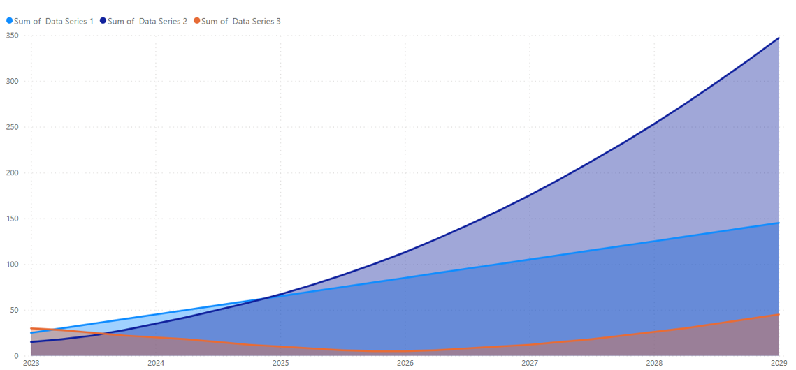
Here are some specific uses of area charts in project management.
- Task progress cumulatively:
Use: Displaying the total progress of jobs or project steps over time.
Benefit: Bar graphs can show the total finish of jobs, giving information about how a project is going forward. This helps to follow patterns and find times when tasks are completed faster or slower.
- Budget tracking cumulatively:
Use: Looking at the total money spent so far against what was planned.
Benefit: Bar charts show total spending patterns. They make it simple to see how real expenses add up compared to the planned budget. This helps project leaders make better choices about money and budgets.
- Aggregate risk exposure trends:
Use: Showing how much you have been exposed to project risks over time.
Benefit: Line charts can show the total effect of known risks, helping project leaders to understand how being exposed to risk changes during the job. This helps to manage and reduce risks before they happen.
- Project progress over time by phase:
Use: Showing the total progress of a project divided by different stages.
Benefit: Bar charts help project leaders see how progress builds up across different parts of a job. This helps them understand successes and possible blockages in key areas better.
Box-and-whisker chart
The box and wrinkle chart, also known as the box diagram, can be useful for various purposes in project management.
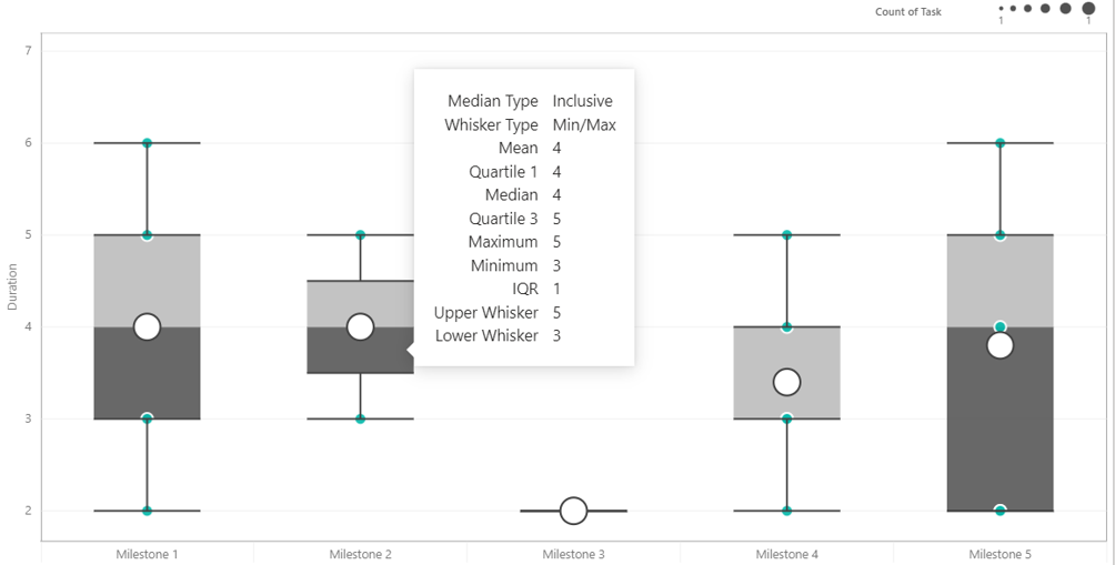
Here are some common uses for Box-and-Whisker charts in project management.
- Task duration distribution:
Use: Graph the distribution of work time in a project.
Benefit: Box-and-belt charts give a clear picture of the amount and distribution of time spent. This helps project managers understand changes in deadlines and identify potential overruns.
- Cost distribution:
Use: Shows the allocation of project costs.
Benefit: Box and wool charts can represent changes in project costs, helping project managers identify broader costs. This is valuable for monitoring expected budgets and identifying potential cost overruns.
- Task complexity comparison:
Use: Compare the complexity of different tasks in a job.
Benefit: Box-and-belt layouts visually display the distribution of complex workloads, helping project managers see a wider variety of tasks. This information is valuable for resource allocation and risk management.
- Quality metric distribution:
Use: Graphical distribution of quality metrics (error rates, test coverage).
Benefit: Box and belt systems provide insight into changes in quality design, helping project managers understand broader efficiencies, thereby supporting continuous improvement efforts.
- Group performance analysis:
Use: Evaluating the performance of teams within a project.
Benefit: Box-and-whisker charts can be used to compare performance estimates by teams, to highlight variations in productivity, completion rates, or other relevant factors.
- Project phase comparison:
Use: Comparison of duration or performance stages.
Benefits: A box and belt system allows project managers to compare variables and duration allocations across project phases, thereby aiding in strategic planning and decision-making.
Transform your project management approach with these visuals for unparalleled clarity in your projects. At August Infotech, specializing in white-label website development, we can assist you in achieving and exceeding your project goals by providing extraordinary vision and insights with our team of offshore developers. Feel free to reach out to us at August Infotech.