


Introduction
Welcome to our blog on Power BI! Here, you’ll get some practical insights and best practices for effective data analysis and visualization using Power BI. Whether you’re new to Power BI or an experienced user, our goal is to help you make the most of this powerful tool. We’ll explore how Power BI can be leveraged by offshore developers to enhance collaboration and streamline data-driven decision-making processes.
Index:
- Mastering Data Organization
- Creating Data Categories
- Synchronizing Date Formats
- Visualizing KPIs with Cards
- Visual Harmony with Alignment
- Streamlining Visual Interaction
- Deep Dive with Drill through
- Quick Filter Reset
- Efficient Navigation Techniques
1. Mastering Data Organization
- Grouping data allows you to organize and summarize your data for reporting and visualization purposes.
Steps:
i. Open Table View -> Select the column you want to group -> Column Tools -> Data Groups -> New Data Groups
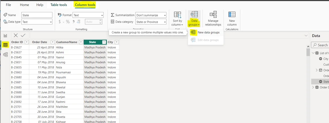
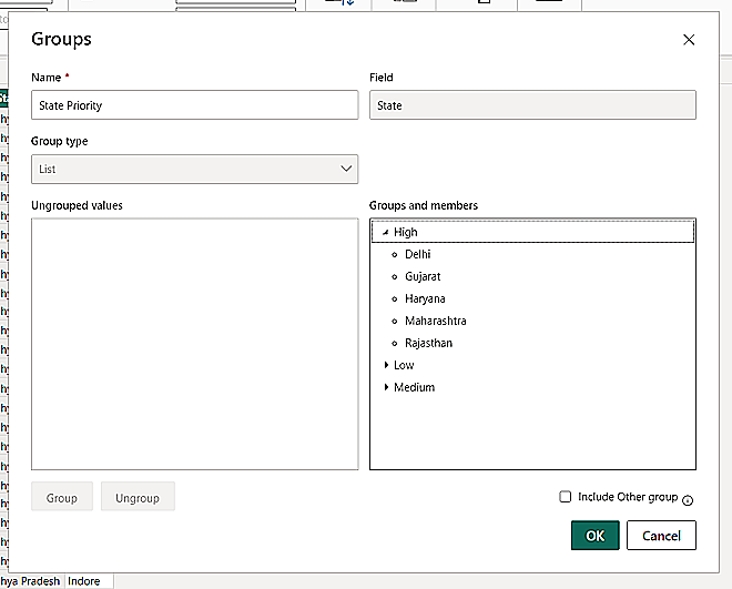
ii. Select the items which you want to group. For example, in the below image the user wants to group the states on a priority basis.
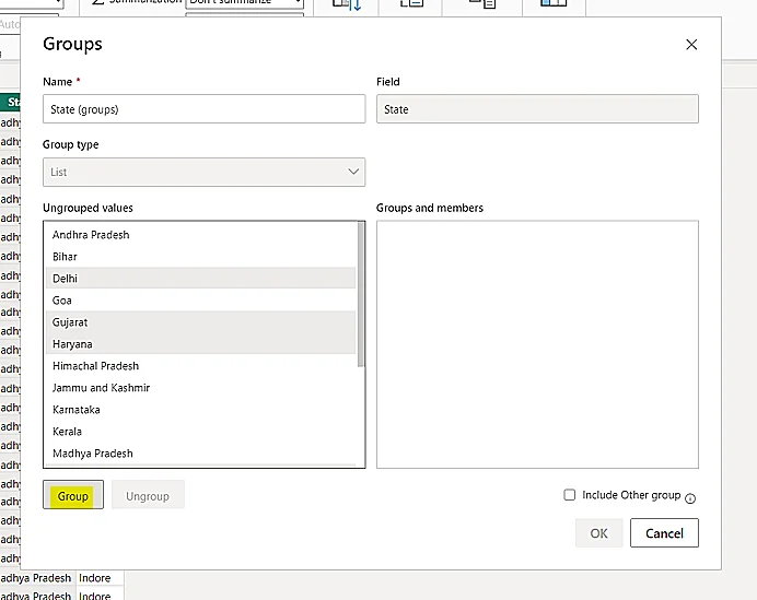
iii. Rename the group and name of your column as per your preference and click OK.
2. Creating Data Categories
- It allows you to specify how Power BI should treat the values in a column. This can be useful for controlling how data is aggregated, sorted, and displayed in visualizations.
Steps:
i. Open Table View -> Select the column -> Column Tools -> Data Category

In the above image, after categorizing data as ‘State or Province’ you can see a little globe icon against the column name on the right side of the screen. It displays that the column has been categorized.
3. Synchronizing Date Formats
- A consistent date format can help to improve the quality of your data by reducing the number of errors that can occur when converting dates from different formats.
- A consistent date format makes it easier for users to understand your reports and dashboards. This is because users do not have to learn multiple date formats in order to interpret your data.
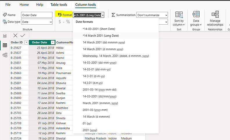
- You can change your preferred date format by going to Column tools -> Format
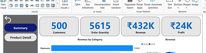
4. Visualizing KPIs with Cards
- KPI cards are used in Power BI to display key performance indicators (KPIs) in a concise and easy-to-understand format.
- It cards can help everyone to understand the current state of the business and make informed decisions.
Example:
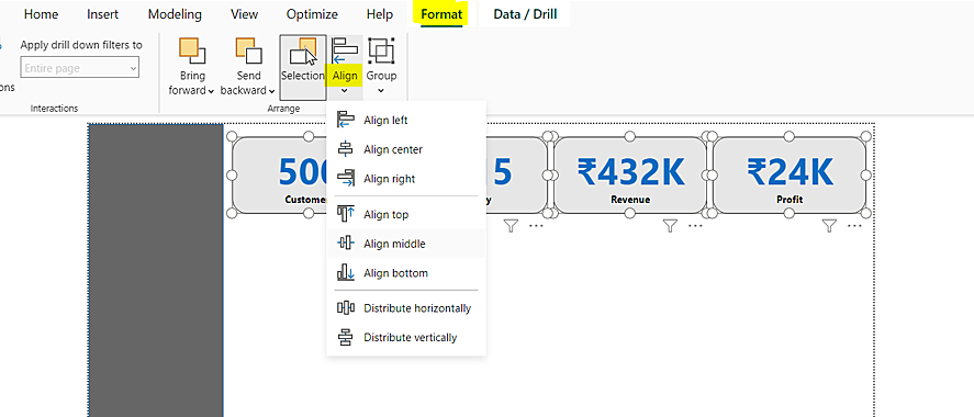
5. Visual Harmony with Alignment
- When you get the alignment right, it’s like a one-time investment. You won’t need to tinker with resizing constantly and adjustments, even when you have a multitude of visuals. It’s the secret to saving your valuable time and making your data adventures both productive and delightful!
Steps:
i. Select the visuals -> Format -> Align
6. Streamlining Visual Interaction
- By limiting interactions between visuals, you can reduce clutter and confusion in your reports. Users can focus on one visual at a time, making it easier to understand and interpret the data.
- Fewer interactions mean users don’t have to worry about unintentional changes when clicking or selecting elements in one visual affecting others. This simplifies navigation within the report.
- Complex interactions can make a report challenging to use, especially for those who are not familiar with the tool. Reducing interactions streamlines the user experience, making it more accessible to a broader audience.
Steps:
i. Select the visual -> Format -> Edit Interactions
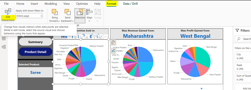
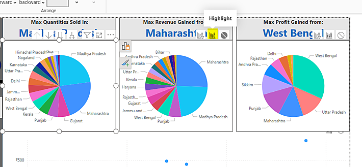
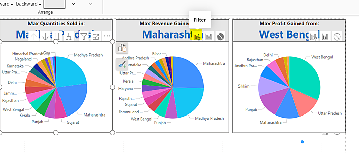
ii. Now, you can see small icons over all the other visuals. Clicking the right-most icon ‘None’, eliminates the connection between two visuals.
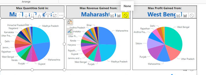
iii. Selecting ‘Highlight’, will highlight parts which are related to the selected visual.
iv. Selecting ‘Filter’ will alter the whole visual according to the selected visual.
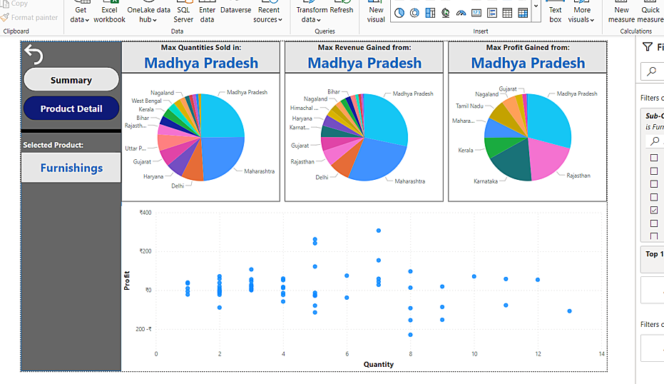
7. Deep Dive with Drillthrough
- Drillthrough allows users to explore and analyse data at a granular level. It’s particularly useful when users want to investigate specific data points further to gain a better understanding.
- It makes Power BI reports more interactive and user-friendly, as users can choose when and where to drill down into data, giving them control over their analysis.
- Instead of building complex visuals with all levels of detail, designers can create summary visuals and use Drillthrough to provide the underlying data when needed. This saves report-building time and improves report performance.
Steps:
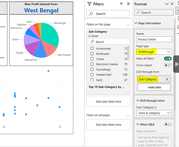
i. Open the format pane for the page which you want to keep at the drill down level. Then select the page type as ‘Drillthrough’ and select the variable which you want to drill down from.
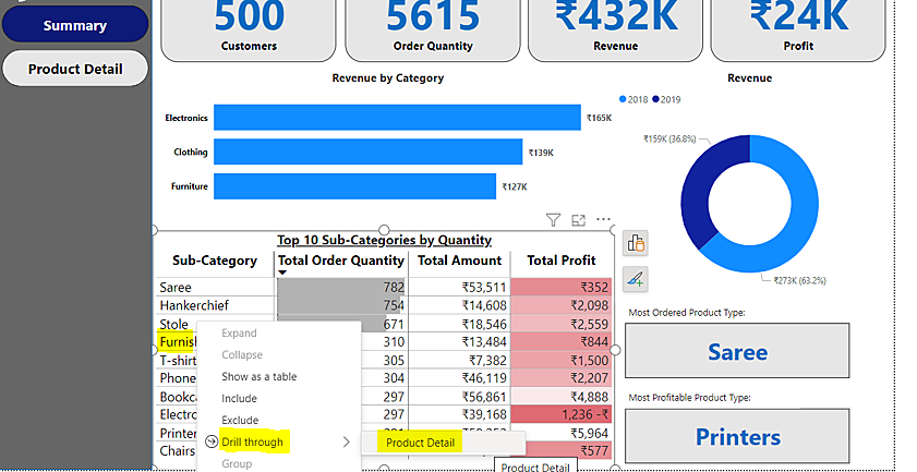
ii. Go to the parent page and right-click on the previously mentioned variable, in this case, ‘Sub-category’ -> Drillthrough -> Product Detal
8. Quick Filter Reset
- Users often apply filters to isolate specific data for analysis. The reset filter button allows them to clear these selections easily and return to the original, unfiltered view of the data. This can be particularly helpful when users want to start a new analysis or view the entire dataset again.
- Users can freely experiment with different filter combinations without worrying about getting stuck with a set of filters that might limit their analysis. The reset button provides a safety net for exploring data interactively.
- Including a reset filter button ensures that users can easily return to the standard view, promoting consistency in the user experience and aiding in report usability.
Steps:
i. Turn the page into a standard format as per your requirements and then go to the ‘Bookmarks’ tab and add a bookmark. It captures all the elements of the page in a kept format and when the bookmark is activated the whole page gets back to its standard format.
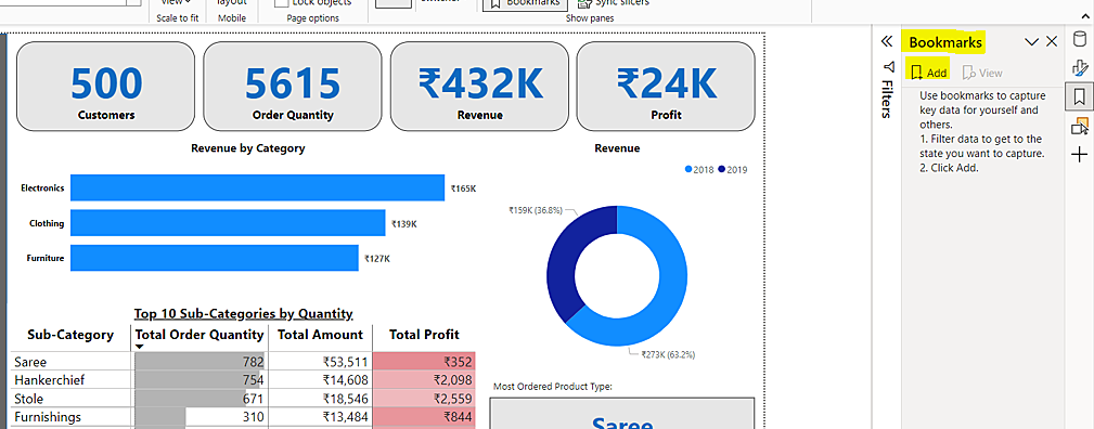
ii. Rename the bookmark so not to have confusion when you add another.
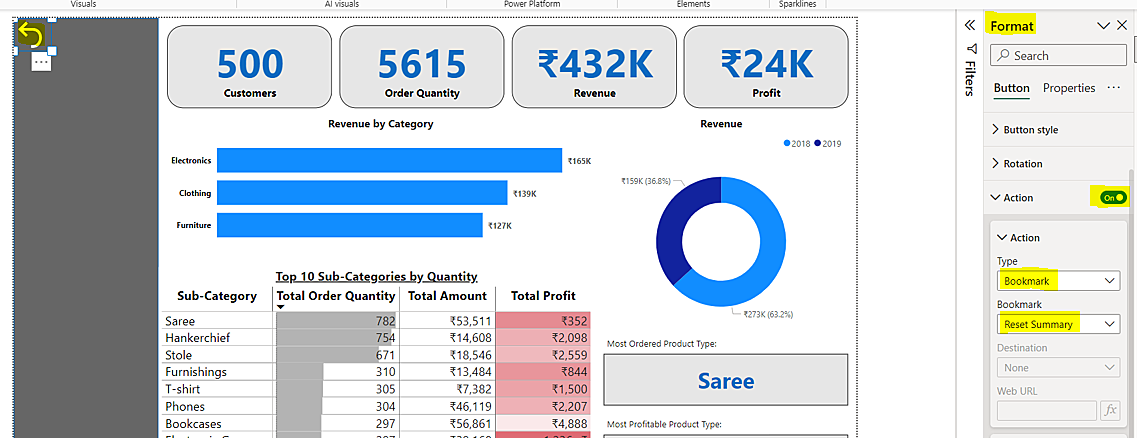
Go to Insert tab -> Buttons -> Reset
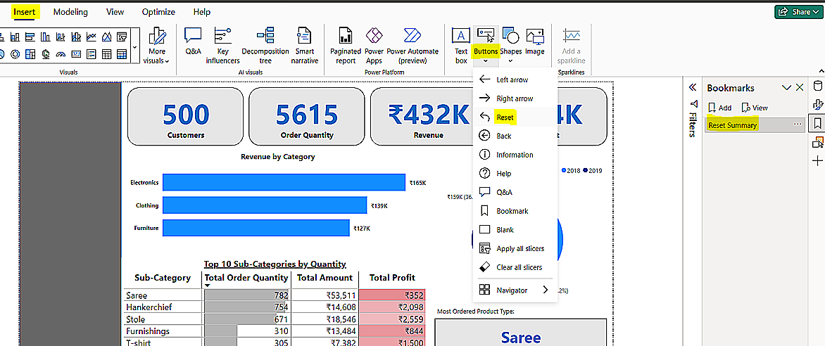
iii. Go to the format pane -> Turn on ‘Action’ -> Select Type ‘Bookmark -> Select your desired bookmark.
When you ‘ctrl+click’ on the button, you will see its effects.
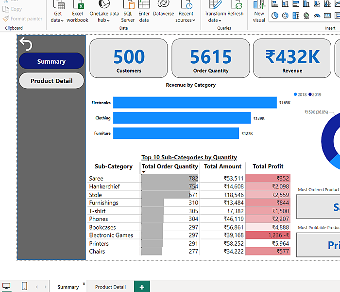
9.Efficient Navigation Techniques
- A navigation bar provides a structured and organized way for users to interact with a report or dashboard.
Steps:
i. Go to the Insert Pane -> Buttons -> Navigator -> Page navigator
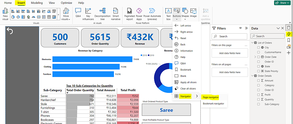
ii. Customize it to fit your needs. See the example below.
By incorporating these techniques into your data analysis and visualization projects, you’ll not only save time but also gain deeper insights and create more compelling reports. Consider our blog as your data science consulting guide, providing personalized insights, and seamless alignment with your business goals in Power BI implementation. So, go forth, implement these strategies, and transform your Power BI experience today.