The world is turning smart with the increasing use of smartphones. Every task that used to be only capable on desktop is now accomplished using the smartphones or tablets including browsing social media outlets, checking emails and doing some online shopping. I wonder what sort of device you’re reading this on? Maybe on a smartphone, while going to work or on a tablet while lazing out on a couch?
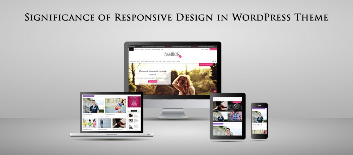
Along with the phone turning smart, your website also needs to be smart enough to flex and adapt to the size of the screen it’s being viewed on and this is what is called Responsive Design! Someone opening the site on a desktop looks exactly the same when browsed on phone.
If you are still not following this, then you need to pay attention to the importance of responsive design in WordPress themes and start making one soon!
1. Help you grow worldwide!
Current market research shows mobile internet usage is growing massively with an increase of 16% from 2010. It simply means that the number of mobile users will overtake the desktop users. Hence to reach this new audience, your WordPress website needs to be mobile friendly! It has been studied that 77% of users have researched a product or service on their device, and 46% of smartphone users have made a purchase on their phone.
Even you will turn to a screen that is closest to you when you need to browse some information!
2. SEO benefits for free!
Using a responsive theme makes you free from managing separate SEO campaigns for mobile and desktop sites. Handling it for 2 sites is difficult, heavy on pocket and lighter on results. Also, you are offering your mobile users an optimized version so you are more likely to rank higher on mobile search.
3. Easy maintenance!
The charm of responsive design is that it is simple to maintain the code as compared to maintaining a separate site for mobile devices. Responsive sites take a little longer to create, but they survive longer and support and upgrades only need be applied to one place.
4. Enhances offline experience!
Most smartphones and tablets are HTML5 enabled, meaning they have offline browsing capabilities and Responsive design allows site owners to deliver quality content to audiences across devices. As a result of this, content such as email newsletters can be read perfectly even in offline mode.
5. Earnings from ads!
Responsive designs tend to bring more revenue with ads. Also if you are running a shopping website, a responsive design makes it super easy and enjoyable for users to browse and shop. Without it, you are losing customers and money.
It is noticed that at the current trend of smartphones, it seems number of mobile internet users will overtake that of desktop users and hence a Responsive WordPress theme is a must.
So free your users from the pinch in and out on their mobile screens to view the content. Provide them stress free browsing capability.
Are you already making responsive WordPress themes? Or want to know more about it?